The Pepsi Globe is the logo for Pepsi: a blue, white, and red design shaped like a sphere. It’s one of the most recognizable logos worldwide because of Pepsi’s popularity in the soda industry. Even someone who doesn’t drink soft drinks could easily identify it.
Before we got the Pepsi Globe logo, the soda brand underwent decades of changes in its brand identity and logo. From its font, color, and to its shape, the Pepsi Globe has a rich history that leads it to where it is today.
Keep reading the article below to learn more about how Pepsi made it to where it is today!
What is the meaning behind the Pepsi logo?
Since its unofficial inception in 1893, Pepsi has undergone many changes, including its recipe, logo, and name. However, the popular soda brand has a rich history behind its logo and the thought process behind it.
When the first formula for Pepsi was created in 1893, the drink was called Brad’s Drink, named after the pharmacist who invented it, Caleb Bradham. The logo for this soda was the name in large, blue font against a white backdrop. It looked like any other soda brand at the time and didn’t really stand out in particular.
Eventually, in 1898, Brad’s Drink was renamed Pepsi-Cola. Soon after, the name was trademarked, and Pepsi-Cola grew rapidly. It also changed the company logo: a spiky font that said Pepsi-Cola, with the letters P and C adjoined and a colon in between instead of a hyphen. Also, rather than the color blue, the logo was made entirely red instead, similar to Coca-Cola.
In 1905, the logo changed again. It still retained its curves and loops but was no longer spiky. Instead, it had a more symmetrical look than the first logo. Finally, a year later, the company changed the logo once more. It was still curved and similar to its previous version, except it now had the word “drink” in it.
In 1950, Pepsi introduced the color blue into its logo and brand, which changed many different things for the brand. The official colors for Pepsi became blue, white, and red, and the logo was introduced along with a bottle cap. These colors also represented the American flag, as Pepsi meant to show patriotism and support after World War II ended.
In 1962, the soda brand let go of the word “cola” from its brand name and logo, officially becoming Pepsi. Then, in 1973, it let go of the bottle cap from its logo and officially adopted the first Pepsi Globe look we know today. Since then, there have been many more changes and variations to the Pepsi Globe.
It was in 2008 when the final version of the Pepsi Globe as we know it today was introduced. The design was created by the Arnell Group and has remained consistent ever since.
What is the hidden message in Pepsi?
Since 1950, Pepsi has used the three colors blue, red, and white for its logo, displaying an obvious patriotic symbolism after World War II. However, according to the designer Peter Arnell of the Arnell Group, there are a lot of hidden symbols behind the Pepsi Globe.
Besides representing the colors of the American flag, the Pepsi logo was designed in such a way as to represent several hidden meanings within it. According to Peter Arnell, the logo symbolizes many concepts, such as the Earth’s magnetic field, feng shui, the theory of relativity, and the golden ratio.
People didn’t really believe this. However, a 27-page document written by Peter Arnell was leaked in 2009, which described all the ideas for the logo. This document lists the hidden meanings behind the new Pepsi logo. This is discussed further in the next section.
Is the Pepsi breathtaking document real?
The Pepsi “breathtaking” document is a work-in-progress file leaked in 2009. Peter Arnell, the new Pepsi logo rebrand designer, created the file. It contained many different ideas and hidden messages that Peter tried to incorporate in redesigning the Pepsi logo.
The 27-page document was full of concepts and ideas on which Peter based the Pepsi logo. Some seem relatively normal, like comparing the past and present logo’s geometric lines and shapes. Some seemed too much, like saying that the Mona Lisa inspired the Pepsi logo.
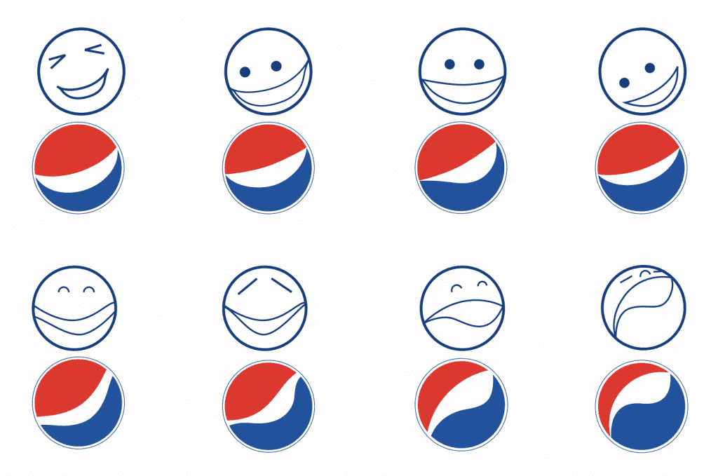
The ideas in the document took inspiration from so many different areas of life. Besides geometry and history, they included the Earth’s magnetic fields and Geodynamo. The Pepsi Globe design was also compared to humans’ different faces and emotions, thus making Pepsi the “face of a new generation.”
The ideas seemed so far-fetched that many people began to wonder if this document was a hoax or was done as a publicity stunt. In addition, the Pepsi logo also faced ridicule for resembling Barack Obama’s campaign logo. So, no one was sure whether to take this document of the Pepsi logo design seriously or not.
However, despite the outrageous comparisons in the document, people still gravitated toward the new Pepsi logo design. In addition, people within the company also voiced their support for Peter Arnell’s design, like Nicole Bradley, a spokesperson for Pepsi. Therefore, this document didn’t hinder Pepsi’s sales and public image.
How much did Pepsi spend on its logo?
Pepsi paid $1 million to Peter Arnell of the Arnell Group in 2009 to develop a new logo. However, after Peter’s document was leaked, many people wondered if it was worth spending a large amount of money on the ideas discussed in the document.
The amount spent on Pepsi’s logo redesign didn’t help lessen the mockery after Arnell’s breathtaking document was leaked. People threw comments about linking the new design to the Parthenon, Mona Lisa, and the sun’s radiation, among many ideas from the document. People joked about how anything could be considered “science” and threw money at it.
It’s still considered one of a famous soda brand’s most expensive logo designs.
Did anyone win the Pepsi Jet?
No one ever won the Pepsi Jet. John Leonard, the man who tried to use Pepsi points to get his own Harrier fighter jet, lost the case against Pepsi on August 5, 1999. The backstory behind this case is an interesting one.
The case took place in the 1990s during the Cola Wars. At the time, Pepsi was spending a lot of money on advertisements to poach Coca-Cola fans onto its side. In one of the ads, Pepsi advertised that consumers could gain Pepsi points through their bottles or cans and exchange those points for gifts.
Some of these gifts included a t-shirt for 90 points, sunglasses for 120 points, and even a leather jacket for 1400 points. The ad ended with a teenage boy flying a Harrier jet which he supposedly got for 7 million Pepsi points. The ad also stated that Pepsi points could be bought for 10 cents each.
That is when John Leonard decided to team up with his friend Todd Hoffman, a businessman two decades older than John. The two tried to use this loophole to get Pepsi to give them a Harrier fighter jet. However, when they tried to give Pepsi their check for $700,000, Pepsi dismissed them, saying it was just a joke.
Eventually, the case was taken to court in 1999. John Leonard claimed there was no disclaimer in the ad to clarify that it was a joke and that he deserved a Harrier jet. The judge, however, ruled in favor of PepsiCo instead, stating that no reasonable person would believe that the ad was making a serious offer.
Recently, in November 2022, Netflix released a docuseries named “Pepsi, Where’s My Jet?” based on the true story of John Leonard and the Pepsi Points Case.
Conclusion
The Pepsi Globe went through many ups and downs to become the logo it is today. First, it started with an entirely different name: Brad’s Drink. Then, it slowly made its way to becoming Pepsi, with the font, color, and design changing throughout as well.
The Pepsi logo faced controversies and backlash, especially in 2009 when Peter Arnell’s design document was leaked.
Even if Pepsi paid outrageous amounts for its new logo, it worked out great for the company. Despite the drama, the Pepsi Globe is now one of the most well-known logos in the world. So, it worked out great for Pepsi in the end.