We all know the red and white logo behind that drink that we can’t just stop having. Like everything about the company, the history of the logo itself is pretty interesting. How do you think the first logo was? Did you even know there was a different one in the first place?
In this article, we’ll delve into the history and symbolism of the iconic Coca-Cola logo. We’ll explore what the logo represents, why it has changed over the years, and what the new logo looks like. Plus, we’ll uncover some hidden messages hidden in Coke cans and explain why they’re always red.
What Does The Coca-Cola logo symbolize?
The Coca-Cola logo is one of the most famous and iconic logos in the world. The bright red color and unique cursive font make it instantly recognizable, but what does it symbolize?
Firstly, the red color of the Coca-Cola logo is meant to symbolize the bold and vibrant nature of the brand. It’s a color that catches the eye and immediately draws attention, which is precisely what a logo should do.
The red color also evokes feelings of excitement and happiness, which are both key ingredients in the enjoyment of a refreshing Coke.
The cursive font of the Coca-Cola logo is equally important in terms of symbolism. The flowing and graceful lines of the font convey a sense of movement and energy, which is fitting for a drink meant to be enjoyed on the go. The font also has a timeless and classic quality to it, which speaks to the enduring popularity of Coca-Cola as a brand.
The Coca-Cola logo perfectly represents the brand’s core values and identity. It’s bold, vibrant, and energetic, a logo that will continue to be recognized and beloved for generations.
Why Did Coca-Cola Change its logo?
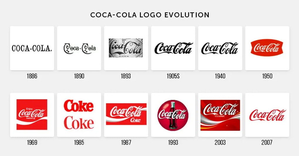
In 1885, when John Pemberton first invented Coca-Cola, the logo was simply the brand name written in a distinct cursive script. This logo remained unchanged for over a century until the late 1990s, when the company decided to modernize and refresh its image.
One of the critical reasons for the change was that the old logo had become quite dated and no longer reflected the vibrant and dynamic brand that Coca-Cola had become. The company wanted a logo that would appeal to younger consumers, and that would be more in line with the changing tastes and preferences of the market.
Another reason for the change was that the old logo was hard to read, especially when printed on small packaging or billboards. The company wanted a more legible logo, and that would be easily recognizable, even when viewed from a distance.
The new logo, introduced in 1999, features the brand name written in a bold and modern sans-serif font with a distinctive curved wave underneath. This new logo has been well-received by consumers and has helped to refresh and modernize the brand’s image.
What is Coca-Cola’s New logo?
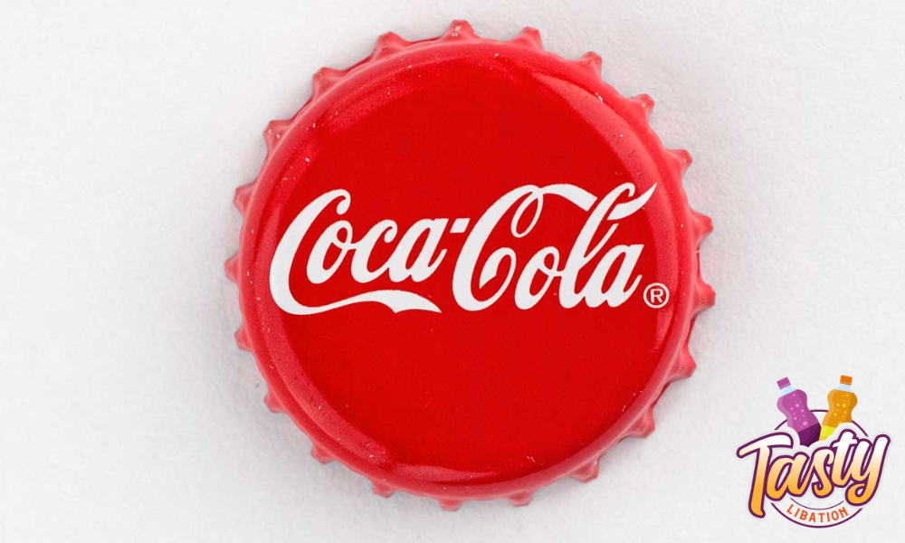
Coca-Cola is known for its iconic red and white logo, but the company recently changed its design. The new logo is still red and white, but it features a more modern and streamlined look.
Gone are the days of the old-fashioned cursive font and the wavy white lines that used to sit underneath the brand’s name. Instead, the new logo features a bold, sans-serif font that is much easier to read. The white lines are now gone, and the brand’s name is written in all capital letters.
This new logo is part of Coca-Cola’s efforts to modernize its brand and appeal to a younger audience. The company wants to show that it is still relevant and innovative, and the new logo reflects that.
But don’t worry, Coca-Cola fans, the company hasn’t completely abandoned its heritage. The iconic red color and the Coke bottle shape are still there, so the brand’s classic look is still recognizable.
Hidden Messages in Coca-Cola Cans
Have you ever noticed that the Coca-Cola cans in your fridge have hidden messages? No, we’re not talking about secret codes or anything like that. But if you take a closer look, you’ll see that the letters on the cans are arranged to spell out fun and exciting phrases.
For example, the cans might spell out “Enjoy Coke” or “Refreshment Ahead.” These hidden messages are known as “wordmarks,” They’re a clever way for Coca-Cola to add a little extra fun to their packaging.
But why do they do it? Well, for one, it’s a great way to grab people’s attention. When standing in front of a fridge full of soda, a can with a hidden message is likely to catch your eye. It also adds a sense of playfulness and whimsy to the brand which Coca-Cola is known for.
But the wordmarks serve a practical purpose as well. Because the cans are so small, there’s only so much space for the brand’s logo and other branding elements. The wordmarks help to fill in that space creatively and engagingly.
If you want to try and find some hidden messages on your Coca-Cola cans, all you have to do is look for the letters that spell out a word or phrase. They might be arranged in a straight line, or they might be curved or tilted in some way. It’s a fun little game you can play the next time you grab a Coke from the fridge.
So the next time you pop open a cold one, take a closer look at the can and see if you can spot any hidden messages. It’s a fun way to add a little extra enjoyment to your favorite beverage. And who knows, you might even discover a new favorite phrase on your Coca-Cola can!
What is Coca-Cola’s Most Famous Slogan?
Coca-Cola’s most famous slogan is undoubtedly “Open Happiness.” This catchy phrase was first introduced in 2009 and has since become synonymous with the iconic soft drink brand.
The idea behind the slogan is simple: Coca-Cola brings people together and brings joy to their lives. Whether you’re enjoying a cold Coke on a hot summer day, sharing a bottle with friends at a barbecue, or simply taking a refreshing sip on your own, the drink has the power to put a smile on your face.
But “Open Happiness” is more than just a slogan – it’s a philosophy that has permeated every aspect of Coca-Cola’s marketing and branding. From advertisements featuring people from all walks of life coming together to enjoy a Coke to the iconic Coke bottle, the message of happiness and togetherness is clear.
But what makes “Open Happiness” such a successful slogan? For one, it’s short, sweet, and easy to remember. It’s also positive and uplifting, which is always a winning combination. Plus, it speaks to the unique emotional connection that many people have with Coca-Cola.
Why Are Coke Cans Red?

Coke cans are red for a pretty simple reason: it’s the color that’s most closely associated with the brand. Coca-Cola is one of the world’s most recognizable brands, and part of that is due to the color red, which has been a part of the company’s branding since its earliest days. It was also said that the company started painting its soda barrels with the bright red color to help differentiate from alcohol during the prohibition era.
But why red? There are a few theories out there. Some people believe that the company’s founder, John Pemberton, chose red because it’s a bold and attention-grabbing color that would make its products stand out on store shelves. It was also a sign of promise, that you could find an ice-cold coca-cola product here.
Others believe that red was chosen because it’s a color that’s associated with warmth, happiness, and joy, which are all emotions that the company wants to evoke in its customers.
Regardless of why Coke cans are red, one thing is sure: it’s a color that’s become synonymous with the brand. When you see a red can, you know it’s Coke, and that’s part of the company’s success.
Conclusion
Who knew the Coca-Cola logo had such a rich history and hidden meanings?
From symbolizing the refreshing, fizzy nature of the drink to changing to keep up with the times, the Coca-Cola logo is a true icon. And don’t even get us started on those sneaky hidden messages on the cans or the significance of that iconic red color.
It’s clear that Coca-Cola puts a lot of thought and care into its branding and design. So the next time you crack open a cold Coke, take a moment to appreciate the history and symbolism behind that classic logo.
